 "Jonathan Hays" (K5Blazer91)
08/22/2013 at 22:46 • Filed to: Cadillac Elmiraj, Crest, Wreath
 2
2
 26
26|
"Jonathan Hays" (K5Blazer91)
08/22/2013 at 22:46 • Filed to: Cadillac Elmiraj, Crest, Wreath | 2
| 26 |
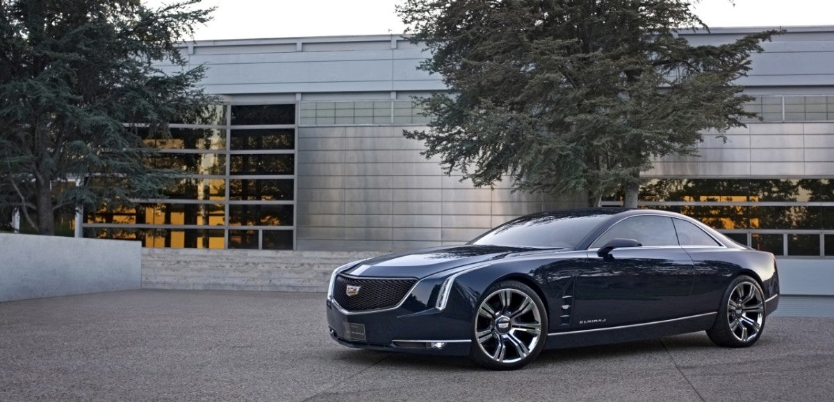
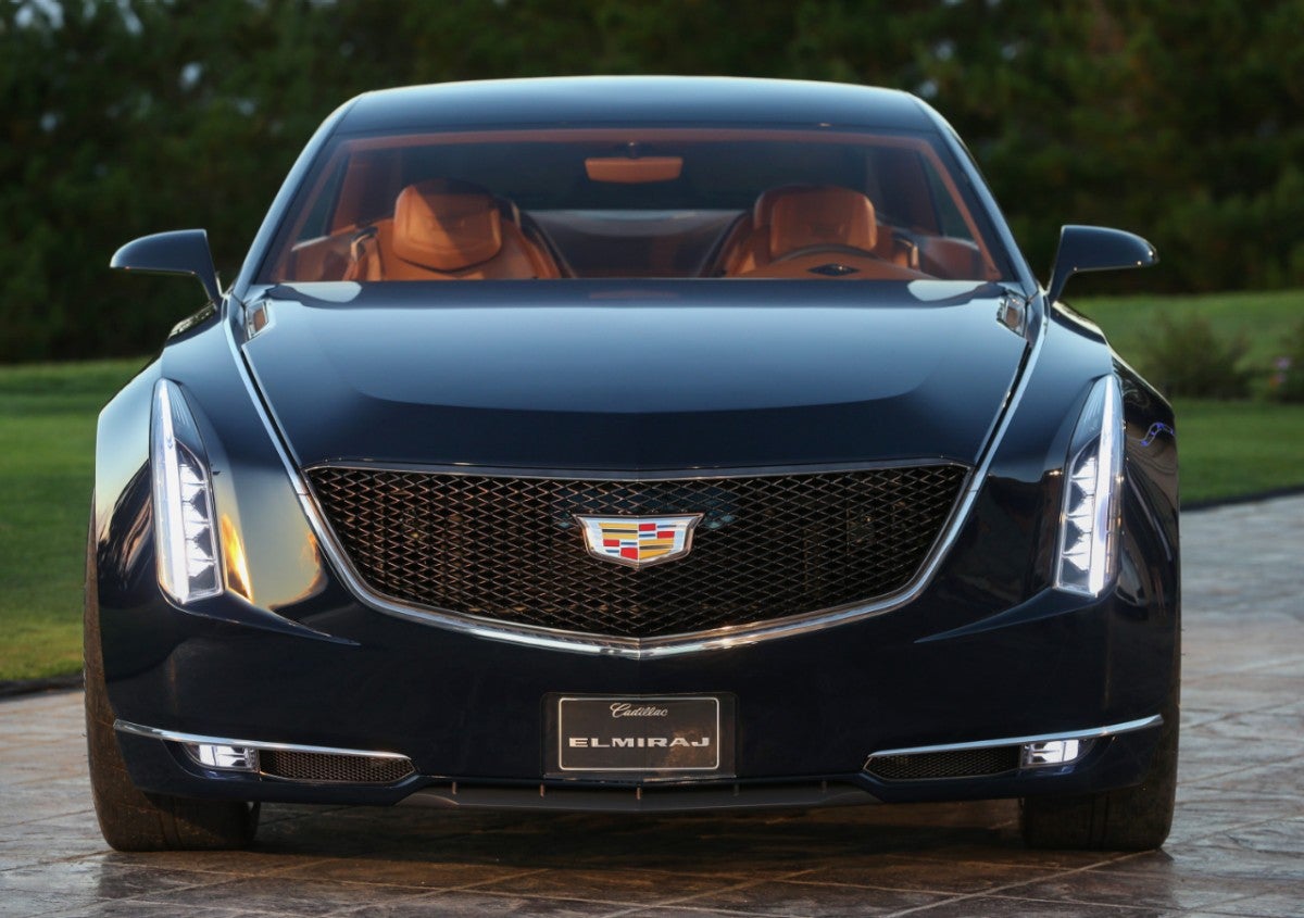
It's been a few days since the unveiling of the Cadillac Elmiraj design study and I've since had the opportunity to read a few of the reviews and subsequently the comments on these reviews. The general consensus of course being the pleading by nearly everyone and their brother for Cadillac to build a flagship like it. Amidst all the hype of the Elmiraj, one thing stands out to me: the loss of the Cadillac "ducks" is still a big deal! Yes, that's right, not the stretching of the Cadillac crest or the loss of the wreath, just the ducks! The question for me then is: who really cares about the ducks!?
Before I go any further, I should preface this by saying I'm not all that nostalgic for the good ole' days. Don't get me wrong, I love old Cadillacs with a fiery passion and would love to have one in the garage; however, in the modern era we live in I'm not about to hope for a retro-esque touch for a brand on the brink of an incredible resurgence in the hearts and minds of Americans and our friends around the world. Personally, I think the crest looks good without the ducks, dare I say I'd slap an Elmiraj crest on a '59 if I had one!

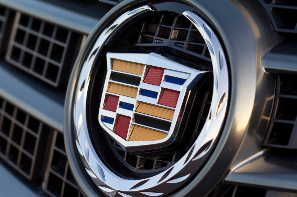
The loss of the ducks in my eyes had always been the right move, perfectly in-line with pushing the brand forward into the Art and Science era. Instantly the logo came across as younger, more technical, and less fussy. It felt like Cadillac had removed the serifs on an old font to create something sleek and clean, and I loved it. Many didn't feel this way, crying fowl on Cadillac's rebranding effort. "Sure, keep the sleek new looks of the wreath and crest, but don't touch the ducks!" they say. This grudge has remained for over a decade and has once again resurfaced with the debut of the newest and most radical iteration of the crest yet, as seen on the Elmiraj.
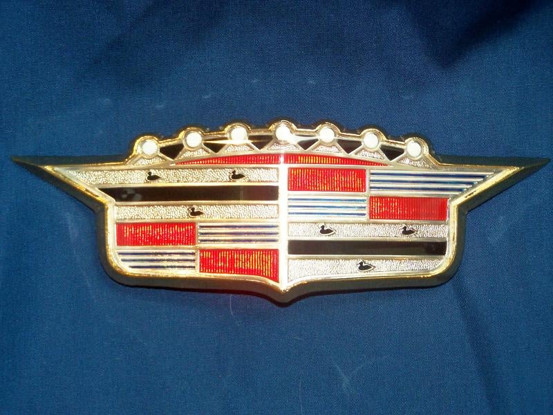
To me the ducks always looked tacked on and far from the martins they're intended to represent. Heck, I didn't know they were martins until Torch made that infographic! To me, they didn't look much better than six silhouettes of the classic rubber bathtub ducky. A brief Google search revealed to me that the ducks have significance in their meaning, standing for the nobility of Antoine de laMothe Cadillac's father and mother as well as the holy trinity. That certainly lends the ducks a degree of staying power on the crest, however, I'm still not convinced they belong on the global automaker that Cadillac is today.
Beyond the ducks, the colors seen on the Cadillac crest are equally as symbolic. Red squares signify boldness, the blue stripes valor, and silver purity. These are all qualities I can see in Cadillac today, from their bold design style, to the uniqueness of the their model lineup compared to the rest of the GM portfolio. Consider this though: The United States chose to eliminate title of nobility at the founding of our nation, so does it not make sense for Cadillac then to remove the ducks for their symbol of nobility from what is decidedly an American brand?

Certainly, Antoine de laMothe Cadillac was of the French nobility and I can understand the ducks being included in the crest of early Cadillacs, but isn't it time to allow Cadillac to do what is necessary to fully become the all American luxury powerhouse they need to be to survive in a global market? Maybe I'm just a millennial who doesn't know what he's talking about, or just how important the ducks are, but in the interest of cheering Cadillac on, I'm perfectly alright with their loss, and if I had to guess, I'd think very few people outside of Jalopnik even know the history of the ducks or their symbology anyway, but maybe I'm wrong and so I come to you, Oppo: What's the deal with the ducks? Do they really need to make a comeback? Let me know, or don't!
EDIT: I noted that the ducks were actually martins based on Jason Torchinski's Infographic, I'm told they're actually Merlettes. A quick google search seems to support this.
 BJohnson11
> Jonathan Hays
BJohnson11
> Jonathan Hays
08/22/2013 at 23:15 |
|
"crying foul on Cadillac's rebranding effort."
No no no, you mean "crying fowl"
It's ok, we all make mistakes some times...
|
Jonathan Hays
> BJohnson11
08/22/2013 at 23:25 |
|
What? I see nothing wrong with it. Looks to be spelled correctly, just as you wrote here... :-P
EDIT: just realized I fell for a pun after changing it to "fowl." Nice work sir. I'm leaving it like that though, I like it that way.
 Birddog
> Jonathan Hays
Birddog
> Jonathan Hays
08/22/2013 at 23:32 |
|
They aren't Ducks.
The Cadillac crest has(d) Merlettes.
|
Jonathan Hays
> Birddog
08/22/2013 at 23:34 |
|
Right, and I mention that above. I thought they were martin's though based on Jason Torchinski's infographic, so its all his fault. I called them ducks because that's what so many people have referred to them as, it just seemed right at the time.
|
Birddog
> Jonathan Hays
08/22/2013 at 23:59 |
|
After running through again I realize my 40 year old brain is missing a few things..
I do miss the "ducks" almost as much as my 67 Coupe de Ville.
|
Jonathan Hays
> Birddog
08/23/2013 at 00:11 |
|
My neighbor has one of those! Would love to have one, looks fantastic.
 phenotyp
> Jonathan Hays
phenotyp
> Jonathan Hays
08/23/2013 at 01:50 |
|
They did the right thing with the logo. It's busy enough as it is.
 Stef Schrader
> Jonathan Hays
Stef Schrader
> Jonathan Hays
08/23/2013 at 12:13 |
|
Some say...he knows two facts about martins and both of them are wrong.
|
Jonathan Hays
> Stef Schrader
08/23/2013 at 12:19 |
|
^true story. Haha
 Kookanoodles
> Jonathan Hays
Kookanoodles
> Jonathan Hays
08/24/2013 at 11:45 |
|
I'm all for simplifying logos, or at least keeping them up to date. The new duck-less Cadillac one looks great, while, for example, Porsche's logo is starting to look pretty old-fashioned. And I think it looks weird to have such a complicated and medieval-looking crest on cars as modern and cutting-edge as the GT3 or the 918 Spyder.
 LuczOr
> Jonathan Hays
LuczOr
> Jonathan Hays
08/24/2013 at 12:01 |
|
"Symbology"
Good day to you, sir! I say, good day!
 feather-throttle-not-hair
> Jonathan Hays
feather-throttle-not-hair
> Jonathan Hays
08/24/2013 at 12:47 |
|
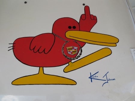
Anyone remember the catera duck?
|
feather-throttle-not-hair
> feather-throttle-not-hair
08/24/2013 at 12:48 |
|
|
Jonathan Hays
> feather-throttle-not-hair
08/24/2013 at 14:36 |
|
Interesting, I completely forgot about the duck. Had to look it up.
|
Jonathan Hays
> Kookanoodles
08/24/2013 at 14:40 |
|
I guess I've never really been bothered by the Porsche crest. Part of that might be that I'm more of a Corvette guy, so I don't pay too much attention to them.
For better or worse, I don't think I'd be bothered either way by Porsche updating it.
 ButlerBoy
> Jonathan Hays
ButlerBoy
> Jonathan Hays
08/24/2013 at 14:42 |
|
I don't care about the birds per se, but as GM has simplified the Cadillac crest it has also removed detail, and it now just looks cheapened. I look at the Elmiraj and that badge just doesn't belong. At best, it looks better than the pictured CTS, but that's not saying much.
|
Jonathan Hays
> LuczOr
08/24/2013 at 14:44 |
|
Now you have me paranoid that I've used/spelled that wrong....
|
LuczOr
> Jonathan Hays
08/24/2013 at 14:55 |
|
LOL I thought you were making a Boondock Saints reference.
|
Jonathan Hays
> LuczOr
08/24/2013 at 16:37 |
|
Haha, no, I guess I missed the reference!
|
Jonathan Hays
> ButlerBoy
08/24/2013 at 16:39 |
|
I could agree with that. The Elmiraj crest is nicely designed, but could use some detailing to make it look more premium.
|
Michael500
> BJohnson11
08/24/2013 at 23:57 |
|
Hey, I see what you did there...
|
Michael500
> Jonathan Hays
08/25/2013 at 00:08 |
|
I don't miss the merlettes (aka ducks). A logo/symbol is MIGHTY important because it evokes an image in the mind of the buyer. The Cad logo DOES bring a soul to the brand. Look how stupid the Lexus and Infiniti logos are, that's because those brands don't have the same soul and pedigree. They must have had an Ad Agency that SUCKED or someone at the top with NO TALENT who approved those horrid, cheap logos. Big win for Cadillac. I like that Alfo Romero logo too!
|
Michael500
> feather-throttle-not-hair
08/25/2013 at 00:10 |
|
I remember the Catera, wasn't the tagline: The Cadillac that sucked?
|
Jonathan Hays
> Michael500
08/25/2013 at 00:47 |
|
I agree Alfa has a great logo! Lexus and infinity don't really have the history to draw from like Cadillac, so I guess that's a limiting factor for them when it comes to drawing inspiration for a logo. Acura isn't much better.
|
feather-throttle-not-hair
> Michael500
08/25/2013 at 13:50 |
|
Pretty much. The one notable thing it did was to eventually lend its chassis to the gto. It was completely unremarkable other than that.
 HoratioGiovanni
> ButlerBoy
HoratioGiovanni
> ButlerBoy
08/29/2013 at 10:02 |
|
I agree. I was okay with the initial redesign back in 2002 or whenever that was, but now, without the wreath, it just looks kinda bland and cheap, with too many solid colors. Sometimes less is more, but when you're dealing with luxury cars, I appreciate something a little more ostentatious.